In a nutshell, A landing page is a separate website with a single task. Think of her as a specialist who knows one thing perfectly. Unlike your main site, which is more like a shopping mall filled with different stores and options, the landing page focuses on a single specific action. It can be collecting emails, registering for a webinar, or selling a single product. Nothing more, nothing less.
Landing page as a bridge between advertising and target
I'm sure you know that. You click on an ad that promises a tempting discount on new sneakers. Instead of a link to the main page of the e-shop, where you would have to search for the sneakers in a flood of other products, you will land directly on a page dedicated to just them. And exactly This is the landing page -- a direct, logical bridge between a promise you saw in an ad and its immediate fulfillment.
Its strength lies in laser focus. While the home page is a signpost with links to a blog, company history or all product categories, the landing page has only one way forward. It leads directly to a single, clearly defined goal — the so-called conversion.
Why can't you do without it in marketing?
The entire design and content of the landing page is subordinated to one goal: to convince the visitor to do what you want them to do. By removing all distracting navigation and unnecessary links, you keep his attention and guide him by the hand exactly where you need to go. The result is tangible benefits:
- Higher conversions: Targeted content and a clear call to action mean that landing pages achieve much better results than regular web pages.
- Accurate campaign measurement: They allow you to simply see how a particular campaign is doing. You know exactly where the visitors came from and what they did.
- Better contacts (leads): When someone fills out a form on a page dedicated to a specific topic, it makes their interest clear. This way you get more relevant leads.
- Easy introduction of news: Do you need to test your interest in a new product or service? The landing page is ideal. You will create it quickly and without having to interfere with the structure of the main site.
A landing page is not just another sub-page of your website. It is a precise marketing tool that effectively turns anonymous visitors into customers and delivers measurable results.
In the Czech environment, where the Internet is 10 million peopleThe landing page has become a necessity. The data shows that already 55% of Czech companies is actively using them to streamline their campaigns. They achieve an average conversion rate. 7-9%which, by the way, is a great result even in international comparison. If you are interested in more, explore the detailed statistics on digital behavior in the Czech Republic Understand the local market better.
Landing page vs. home page
To clarify the difference once and for all, let's look at a direct comparison. While both sites are important, they serve vastly different purposes.
CharacteristicsLanding PageHome PagePrimary objectiveOne specific goal (conversion) Introduce brand, navigateNavigationUsually none or minimalFull navigation (menu, footer)ContentTargeted, single offeringA broad, general overview of the companySource of AttendanceSpecific marketing campaignVarious resources (direct, SEO)Call to Action (CTA)One, very distinct challengeHow many different calls to actionAudienceSpecific audience segmentAll visitors to the site
As you can see, each has its place. The home page is the business card of your business, while the landing page is your best marketer, which focuses on closing one specific deal.
Anatomy of a landing page that sells
A great landing page is no accident. It is a carefully assembled mosaic of psychology and design, where each piece fulfills its task: to guide the visitor smoothly from the first click to the final action. Let's take a look at the key building blocks that decide if a site will just be pretty or if it will really work.
It all starts in hero section That's the first thing a person sees. Think of it as your digital elevator pitch. You only have a few seconds to captivate. The basis is Irresistible headlinethat clearly and strikingly says what the visitor gets. Don't try to be smart at all costs, just be clear.
Just below the headline should be a short description that develops the idea and answers the question that everyone in spirit asks themselves: “What will I get out of this? “The whole hero section is ideally complemented by strong visuals, either a photo or a short video that will emotionally support your message and show the product or service in action.
Elements that build trust and lead to action
Once you have the attention, you need to gain confidence. And here comes the turn Social proof (social proof). People naturally trust other people's experiences more than marketing slogans. This element is absolutely crucial for the visitor to overcome his initial distrust.
Social proof is your silent seller. When a visitor sees that your service is already being successfully used by others, his subconscious tells him: “It's cool, it works, I can trust them. “
Therefore, be sure to add elements to the page that will immediately strengthen your credibility:
- Reviews and ratings: Short, authentic quotes from satisfied customers, ideally with a photo and name.
- Logos of famous clients: If you've worked for companies that people know, brag about it. It acts as an immediate guarantee of quality.
- Case studies: A more detailed demonstration of a concrete success, best supported by real numbers and data.
- The numbers that speak for it all: For example, “Already 10,000+ download” or “Trusts us 500 companies“.
This infographic perfectly summarizes the three basic pillars on which every landing page stands: one single goal, no distractions, and total compliance with the ad that brought visitors to it.
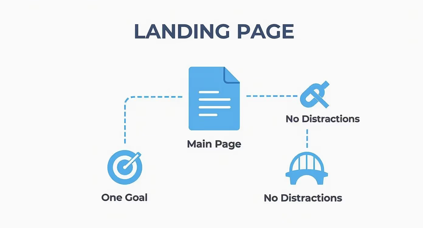
As you can see, the main thing is to keep the laser focus and remove everything that could distract the visitor from the coveted event.
The most important element of all? You have him in front of your eyes
Even the most beautiful page is useless if it lacks bright and motivating Call to Action (CTA). The CTA is the notional top of the whole pyramid. It should be a distinctive button with a short and action text that will tell a person without thinking what will happen when he clicks on it.
Forget boring words like “Submit.” Rather, use text that emphasizes value: “Download the e-book for free”, “I want my discount” or “Try for 30 days”. In addition, the button must be visually different from the rest of the page in order to literally punch your eyes.
If filling out a form is part of the event, keep it as short as possible. Just ask for the most necessary information. Each additional box dramatically reduces the chance of a visitor completing it. As shown by our case study for Lexamo, the thoughtful design of the entire page, as well as the form itself, can skyrocket the number of requests.
What type of landing page to choose for your campaign?
Just as you don't take half shoes on a mountain hike, in marketing you can't use one type of landing page for everything. Each campaign has a different goal and therefore needs its own, tailor-made tool. When you understand the basic types of sites and know when to deploy them, you get the most out of every penny invested in advertising.
It's not about finding a universal template, it doesn't exist. The key is to choose the right format for your particular situation. It is this choice that often determines whether the visitor really does what you want him to do.
Lead Generation Pages: Collecting Valuable Contacts
The main mission of this site is to get contact — most often email — in exchange for something valuable that you offer to the visitor. It's actually kind of a fair deal: you give him useful content, and he gives you his address in return. It is on this principle that the entire database of potential customers is built.
The goal here is not to sell immediately. It's about establishing a relationship. Acquired contact (so-called Leads) you can continue to reach out via email and gradually convince them that your services are right for them.
So what can you offer as such a “magnet for leads”?
- E-books and guides: Give people detailed information about the topic that burns them.
- Webinars and trainings: Offer exclusive access to your know-how and get contacts to people who are serious.
- Checklists and templates: Provide a practical tool that will make their job really easier.
- Free Consultation: Being able to talk to you in person is a great way to get really quality leads.
These pages always focus on a simple form and absolutely clear communication of the value that a person obtains by filling out.
Click-Through Pages: Warm-up Bike Before Buying
Unlike contact collection sites, so-called Click-Through sites do not have a form. Their task is to “heat up” the visitor properly, convince them of all the advantages of the product and send it on smoothly — typically straight to the basket or to the detailed product card.
Think of it as an intermediate hook that provides the interested party with all the arguments he needs to make a decision. There is room for a detailed description of the benefits, technical parameters, videos or comparisons with the competition. The goal is to dispel all doubts and strengthen the desire for the product so that clicking on the “Buy” or “Find out more” button is already a completely logical step. Lots of successful client projects relies on just this type of site to effectively guide the customer through the purchasing process.
Sales and Squeeze Pages: When you go straight to the point
If your only goal is immediate sales, it's your turn Pagina de ventas. It tends to be longer and more elaborate because it has to handle the entire sales process on its own — from attracting attention to building confidence to the final call to action. It's basically your digital marketer, working nonstop.
Its complete opposite is Squeeze Page. It's extremely short, punchy, and focuses on one lightning goal: getting an email address. Often you will find nothing more than a catchy headline, a few points and a distinctive form on it. It comes in handy in those moments when your offer is so tempting that it does not need a long explanation.
How to turn data into better results
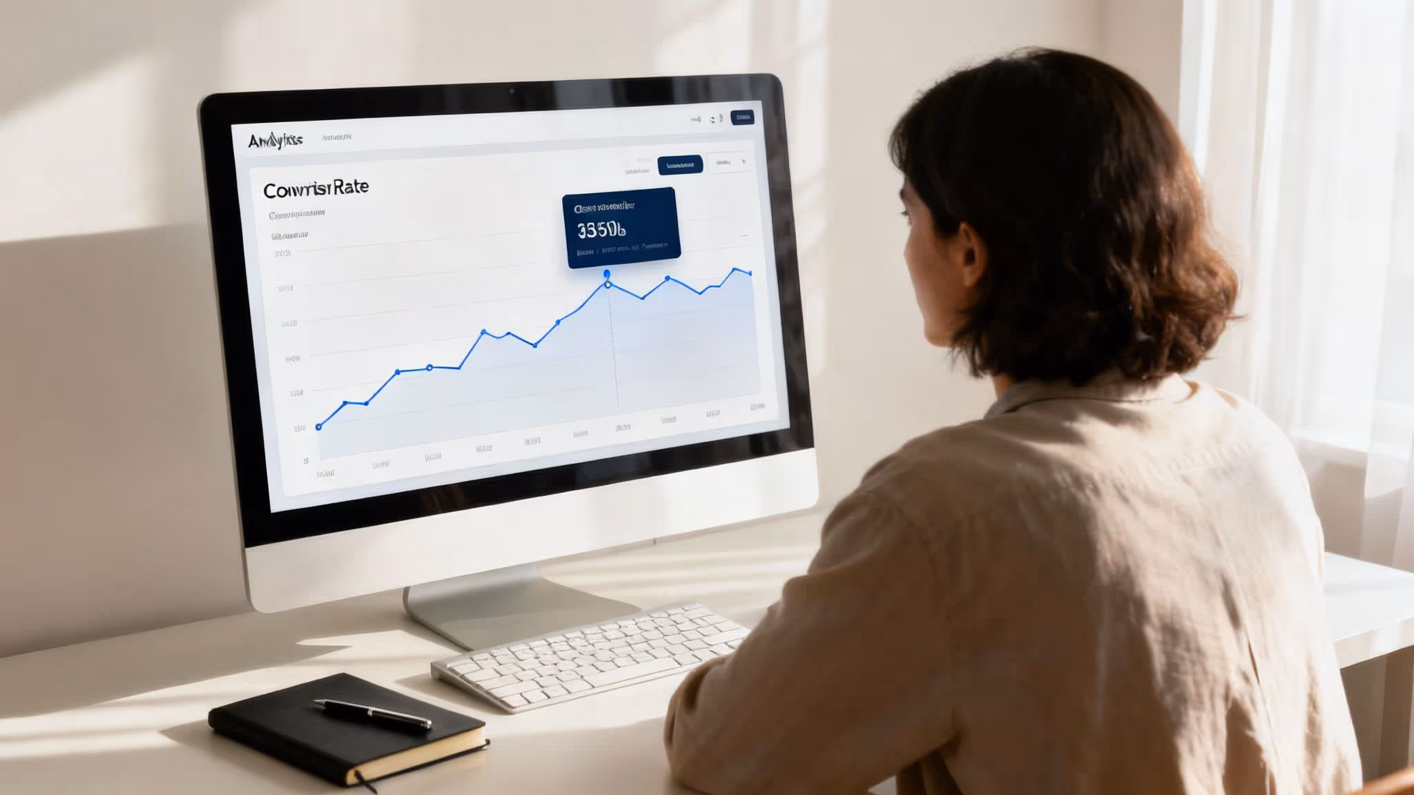
So, landing page is in the world. Done? Kdepak. The best part is just beginning. Your site is really just your best hypothesis at this point. When the real people who come up with it will show you with their clicks (or vice versa, inaction) how the whole thing really works. It's time to stop arguing and start making decisions based on hard data.
The goal is one and only: to understand how visitors to the page behave, where they get stuck, and what kicks them into action. You do not need any expensive and complex tools for this. To begin with, you absolutely need free platforms such as Google Analytics 4 or Microsoft Claritythat will show you not only dry numbers, but even recordings of actual visits.
Key metrics you can't do without
In order to make meaningful improvements to your landing page, you first need to measure how it is doing now. Focus on a few basic metrics that will give you an instantly clear picture.
- Conversion Rate: Metric of all metrics. It tells you the absolutely key thing -- what percentage of visitors did what you wanted them to do. If 100 people come to your page and 5 of them fill out the form, you have a conversion rate 5%.
- Bounce Rate: This is the percentage of people who came in, looked around, and immediately left again without clicking on anything. A high bounce rate often means that the content of the page does not match what the advertisement promised.
- Cost Per Conversion/Acquisition: Simply put, how much it costs you on average to get one contact or customer. Calculate the total cost of the campaign and divide it by the number of conversions. You know right away if it's paying off for you.
With these three numbers in hand, you can easily tell where your shoe is burning and what to focus on first when upgrading.
The magic called A/B testing
Once you have the data, it's time to start experimenting. And by far the most effective method is the good old A/B testing. The principle is ingeniously simple: you create two versions of a page (let's call them A and B) that differ in just one single detail. It could be a headline, a button color, a different image... anything.
You will then automatically divide incoming visitors into two halves. One will see version A, the other version B. After a while, when you've collected enough data (usually hundreds, ideally thousands of visits), you'll look at the results. The numbers will tell you uncompromisingly which option works better.
A/B testing is not a one-time action, it is a continuous process. Believe it or not, even a small change in the text on the button from “Send” to “I want my e-book for free” can increase conversions by tens of percent.
What can you start experimenting with right away?
- Headings and subheadings: Try to look at the main benefit from a different angle.
- Call to Action (CTA): Test different words, different colors, sizes, and button locations.
- Visuals: What happens if you swap a photo for a short video? Or for illustration?
- Forms: Do you really need so many boxes? Try to take one.
With this systematic approach, you will gradually turn your landing page into a tool that is constantly improving, bringing you more predictable and better results.
Practical tools for creation and automation
You have a great idea, a well-thought-out strategy, and now the most important thing — how to build the landing page? Forget the notion that you need an army of programmers. Today, there are plenty of handy tools with which to make a professional and functional page yourself, even if you haven't written a single line of code in your life.
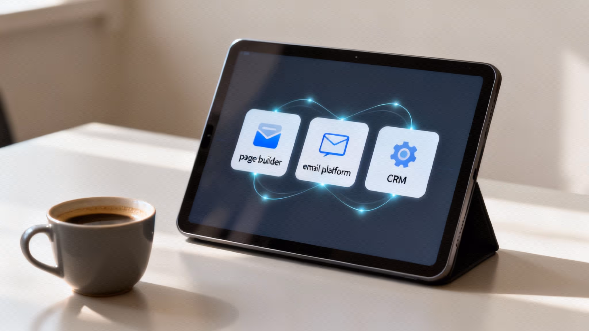
Most often it reaches for the so-called page builder. These are platforms such as Webflow, Instapage or Leadpages, which act as a visual editor. Simply drag and drop and edit individual elements — texts, images, buttons, or forms. It's a bit like composing from Lego; the whole thing is fast and totally intuitive. If you have a website built on the most popular system in the world, it will serve you great WordPress combined with builders like Elementor or Divi.
Connect the site to your digital ecosystem
But the site itself is just the beginning. Its true potential only becomes apparent when you connect it with the other tools you use every day. The landing page will instantly become the automated engine of your marketing and business.
The key to success is not just collecting contacts, but ensuring that something starts to happen to them immediately. Manually rewriting emails from a form to a spreadsheet is a road to hell.
Here are the basic integrations without which it is simply impossible today:
- E-mailing platforms: Linking to tools like Mailchimp, Ecomail or ActiveCampaign is an absolute must. As soon as someone fills out the form, their contact will automatically fall into your database and they can be left with a welcome email or promised e-book right away.
- CRM systems (Customer Relationship Management): Integration with CRM as PipedriveHubSpot, or Salesforce will ensure that every new contact (lead) is instantly logged into your business database. Thus, the sales team has all the information in one place and can attend to it right away.
- Analytical tools: Connecting to Google Analytics 4 gives you a detailed overview of where people are coming to the site, what they are doing on it and if they are fulfilling the goal.
Thanks to this automation, you will save a ton of time and minimize the risk of errors. You can even set up more advanced scenarios, such as your trader getting a notification to Slack every time a form fills in a really interesting lead.
In the Czech Republic, the concept of landing pages has evolved slowly, hand in hand with the growth of the entire online environment. While until 2010, websites focused mainly on general information, with the increasing availability of the Internet, Czech marketers also began to adapt Western strategies. In 2023, approximately 80,000 small and medium-sized enterprises They have been actively using landing pages for their growth. This trend was further kicked in by the pandemic years, which forced companies to optimize their sites. And the result? More than 30% of them saw a direct increase in sales precisely due to these improvements. If you are interested in other data, check out more details information on the development of the Czech digital market.
Frequently asked questions and answers
The topic of landing pages is quite extensive and it is quite normal to have a lot of additional questions pop up. To make this clear, we have written answers to the questions we encounter most often. This overview will help you clarify the practical things that are key to success.
Let's take a look at what companies usually deal with — from budget, to technical details to strategy.
How much does it cost to create a landing page?
There is a huge variance here, the price depends mainly on how you approach it and how complex the site is supposed to be. There is no single universal sum, but we can divide it into a couple of categories.
- When you make it yourself: With the help of templates in tools such as Webflow or Leadpages you can fit in a couple thousand a month for a subscription. It's a great option for quick idea testing and smaller campaigns.
- Working with freelancers: If you hire a handy freelancer or a smaller studio to do it, a simple bespoke site starts at roughly 10,000 CZK.
- Comprehensive solutions from the agency: For sites with original design, professional texts and connections to various systems (CRM, emailing), the price can easily swing over tens of thousands of crowns. Depends on how much depth you go.
Try to look at the landing page not as a cost, but as an investment. A well-made site can earn on itself very quickly, as it effectively brings you new customers.
Does a landing page need its own domain?
Not necessarily, but it's a damn good idea if you want to appear trustworthy. Ideally, if the page runs on a subdomain of your main site (e.g. events.vasweb.cz) or in its subdirectory (vasweb.cz/events). It looks professional and it holds your brand together.
Although some tools allow you to publish the page on their own domain, which lends itself to quick tests that no one will see. But for a sharp campaign, always reach for your own domain. It strengthens confidence and, moreover, you will be much better at working with it in analytical tools.
What is the difference between a landing page and a microsite?
These two terms are often confused, and each is used for something different. The main difference is in scope and purpose.
- Početna stranica There is always only one page. It has one clear goal (conversion) and deliberately lacks any navigation that might distract the visitor. He is a sprinter who is only running for one medal.
- Microsite is actually such a small, separate site that can even have several subpages. It is created for a specific product line or a larger campaign. It may have its own menu and offer more information, but it's still separate from the main corporate site.
Simply put, the landing page is as straightforward and focused as possible, while the microsite allows you to go into greater depth within one narrowly defined topic.
How long should a landing page be?
There is no rule on the ideal length. It always depends on how complex your product is and how much information a person needs to make a decision with a calm heart.
- Short pages: They work perfectly for simple and low-risk actions. For example, download an e-book, subscribe to the newsletter or register for a free webinar. There you just need a catchy headline, a couple of bullet points with benefits and a form.
- Long pages: These come in handy for more expensive or complex products and services. Here you need to gradually build trust, refute possible objections, describe the benefits in detail and use a mass of social evidence. A long page basically guides the visitor through the entire thought march up to the purchase.
The most important thing is to give the customer exactly as many arguments as he needs to click the button with confidence. If you are interested in other practical tips from web design and marketing, explore other articles on our blog.
Do you feel like your website isn't delivering the results it should? IN Oldfriend We design and build websites that not only look good, but also fulfill business goals. Get in touch with us and together we will turn your website into a tool that will truly earn you money. Learn more at https://oldfriend.cz.